 PyEpics: Epics Channel Access for Python
wx: wxPython Widgets for Epics
The wx module of epics (that is, epics.wx) provides a set
of wxPython classes for epics PVs. Most of these are derived from wxPython
widgets, with special support added for epics PVs, especially regarding
when to automatically update the widget based on a changing value for a PV.
Some examples of code that uses pyepics and wxPython are included in the scripts folder of the pyepics source distribution kit. In addition, there are a some full-fledged applications using Epics and wxPython at pyepics applications.
PV-aware Widgets
Several basic wxPython widgets have been extended so as to connect the
widget with a corresponding PV. For example, setting the text value of a
PVTextCtrl will forward that value to the epics PV, and if the
PV is changed by externally, the value displayed in the widget will be
automatically updated.
PVMixin
- class wx.PVMixin([pv=None[, pvname=None]])
This is a mixin class for wx Controls with epics PVs: This connects to PV, and manages connection and callback events for the PV. It provides the following basic methods used by most of the PV<->widget classes below.
- wx.SetPV(pv=None)
set the PV corresponding to the widget.
- wx.Update(value=None)
set the widgets value from the PV’s value. If value=``None``, the current value for the PV is used.
- wx.GetValue(as_string=True)
return the PVs value.
- wx.OnEpicsConnect()
PV connection event handler.
- wx.OnPVChange(value)
PV monitor (subscription) event handler. Must be overwritten for each widget type.
- wx.GetEnumStrings()
return enumeration strings for the PV
PVCtrlMixin
- class wx.PVCtrlMixin(parent, pv=None, font=None, fg=None, bg=None, **kw)
This is a mixin class for wx Controls with epics PVs: This subclasses PVCtrlMixin and adds colour translations PV, and manages callback events for the PV.
- Parameters:
parent – wx parent widget
pv – epics.PV
font – wx.Font for display
fg – foreground colour
bg –
background colour
A class that inherits from this class must provide a method called _SetValue, which will set the contents of the corresponding widget when the PV’s value changes.
In general, the widgets will automatically update when the PV changes. Where appropriate, setting the value with the widget will set the PV value.
PVText
- class wx.PVText(parent, pv=None, font=None, fg=None, bg=None, minor_alarm='DARKRED', major_alarm='RED', invalid_alarm='ORANGERED', auto_units=False, units='', **kw)
derived from wx.StaticText and PVCtrlMixin, this is a StaticText widget whose value is set to the string representation of the value for the corresponding PV.
By default, the text colour will be overridden when the PV enters an alarm state. These colours can be modified (or disabled by being set to
None) as part of the constructor.“units” specifies a unit suffix (like ‘ A’ or ‘ mm’) to put after the text value whenever it is displayed.
Alternatively, “auto_units” means the control will automatically display the “EGU” units value from the PV, whenever it updates. If this value is set, “units” is ignored. A space is inserted between the value and the unit.
PVTextCtrl
- class wx.PVTextCtrl(parent, pv=None, font=None, fg=None, bg=None, dirty_timeout=2500, **kw)
derived from wx.TextCtrl and PVCtrlMixin, this is a TextCtrl widget whose value is set to the string representation of the value for the corresponding PV.
Setting the value (hitting Return or Enter) or changing focus away from the widget will set the PV value immediately. Otherwise, the widget will wait for ‘dirty_timeout’ milliseconds after the last keypress and then set the PV value to whatever is written in the field.
PVFloatCtrl
- class wx.PVFloatCtrl(parent, pv=None, font=None, fg=None, bg=None, **kw)
A special variation of a wx.TextCtrl that allows only floating point numbers, as associated with a double, float, or integer PV. Trying to type in a non-numerical value will be ignored. Furthermore, if a PV’s limits can be determined, they will be used to limit the allowed range of input values. For a value that is within limits, the value will be put to the PV on return. Out-of-limit values will be highlighted in a different color.
PVBitmap
- class wx.PVBitmap(parent, pv=None, bitmaps={}, defaultBitmap=None)
A Static Bitmap where the image is based on PV value.
If the bitmaps dictionary is set, it should be set as PV.Value(Bitmap) where particular bitmaps will be shown if the PV takes those certain values.
If you need to do any more complex or dynamic drawing, you may want to look at the OGL PV controls.
PVCheckBox
- class wx.PVCheckBox(self, parent, pv=None, on_value=1, off_value=0, **kw)
Checkbox based on a binary PV value, both reads/writes the PV on changes. on_value and off_value are the specific values that are mapped to the checkbox.
There are multiple options for translating PV values to checkbox settings (from least to most complex):
Use a PV with values 0 and 1
Use a PV with values that convert via Python’s own bool(x)
Set on_value and off_value in the constructor
Use SetTranslations() to set a dictionary for converting various PV values to booleans.
PVFloatSpin
- class wx.PVFloatSpin(parent, pv=None, deadTime=500, min_val=None, max_val=None, increment=1.0, digits=-1, **kw)
A FloatSpin is a floating point spin control with buttons to increase and decrease the value by a particular increment. Arrow keys and page up/down can also be used (the latter changes the value by 10x the increment.)
PVFloatSpin is a special derivation that assigns a PV to the FloatSpin control. deadTime is the delay (in milliseconds) between when the user finishes typing a value and when the PV is set to it (to prevent half-typed numeric values being set.)
PVComboBox
- class wx.PVComboBox(parent, pv=None, **kw)
A ComboBox linked to a PV. Both reads/writes the combo value on changes.
PVEnumComboBox
- class wx.PVEnumComboBox(parent, pv=None, **kw)
- A ComboBox linked to an “enum” type PV (such as bi,bo,mbbi,mbbo.) The ComboBox
is automatically populated with a non-editable list of the PV enum values, allowing the user to select them from the dropdown.
Both reads/writes the combo value on changes.
PVEnumChoice
- class wx.PVEnumChoice(parent, pv=None, font=None, fg=None, bg=None, **kw)
This will create a dropdown list (a wx.Choice) with a list of enumeration states for an enum PV.
PVAlarm
- class wx.PVAlarm(parent, pv=None, font=None, fg=None, bg=None, trip_point=None, **kw)
This will create a pop-up message (wx.MessageDialog) that is shown when the corresponding PV trips the alarm level.
PVCollapsiblePane
- class wx.PVCollapsiblePane(parent, pv=None, minor_alarm='DARKRED', major_alarm='RED', invalid_alarm='ORANGERED', **kw)
This is equivalent to wx.CollapsiblePane, except the label shown on the pane’s “expansion button” comes from a PV.
The additional keyword arguments can be any of the other constructor arguments supported by wx.CollapsiblePane.
By default, the foreground colour of the pane button will be overridden when the PV enters an alarm state. On GTK, this means the colour of the triangular drop-down button but not the label text. These colours can be modified (or disabled by being set to
None) as part of the constructor.Supports the .SetTranslation() method, whose argument is a dictionary mapping PV values to display labels. If the PV value is not found in the dictionary, it will displayed verbatim as the label.
Decorators and other Utility Functions
- wx.DelayedEpicsCallback()
decorator to wrap an Epics callback in a wx.CallAfter, so that the wx and epics ca threads do not clash This also checks for dead wxPython objects (say, from a closed window), and remove callbacks to them.
- wx.EpicsFunction()
decorator to wrap function in a wx.CallAfter() so that Epics calls can be made in a separate thread, and asynchronously.
This decorator should be used for all code that mix calls to wx and epics
- wx.finalize_epics()
This function will finalize epics, and close all Channel Access
communication, by calling epics.ca.finalize_libca(). This may be
useful when closing an application, as in a method bound to wx.EVT_CLOSE
event from a top-level application window. Be careful to not call this
function when closing a Window if your application is not closing, and if
you are still doing any Channel Access work in the other windows.
wxMotorPanel Widget
A dedicated wx Widget for Epics Motors is included in the wx module
that provides an easy-to-use Motor panel that is similar to the normal MEDM
window, but with a few niceties from the more sophisticated wx
toolkit. This widget can be used simply as:
import wx
from epics.wx import MotorPanel
....
mymotor = MotorPanel(parent, 'XXX:m1')
A sample panel looks like this
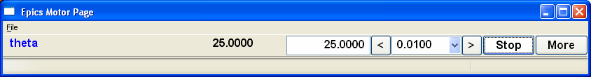
Which shows from right to left: the motor description, an information message (blank most of the time), the readback value, the drive value, arrows to tweak the motor, and a drop-down combobox for tweak values, a “Stop” button and a “More” button. The panel has the following features:
All controls are “live” and will respond to changes from other source.
The values for the tweak values in the ComboBox are automatically generated from the precision and travel range of the motor.
The entry box for the drive value will only accept numeric input, and will only set the drive value when hitting Enter or Return.
The drive value will change to Red text on a Yellow background when the value in the box violates the motors (user) limits. If Enter or Return when the the displayed value violates the limit, the motor will not be moved, but the displayed value will be changed to the closest limit value.
Pressing the “Stop” button will stop the motor (with the .SPMG field), and set the Info field to “Stopped”. The button label will change to “Go”, and the motor will not move until this button is pressed.
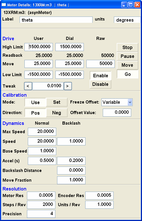
Finally, the “More” button will bring up a more complete form of Motor parameters that looks like:
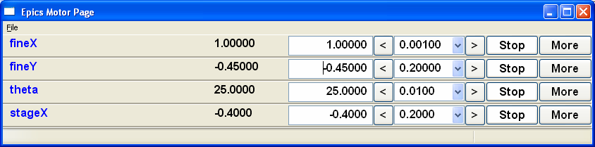
Many such MotorPanels can be put in a vertical stack, as generated from the ‘wx_motor.py’ script in the scripts folder of the source distribution as:
~>python wx_motor.py XXX:m1 XXX:m2 XXX:m3 XXX:m4
will look like this:
OGL Classes
OGL is a graphics drawing library shipped with wxPython. Is it built around the concept of “shapes” which are added to “canvases” and can be moved, scrolled, zoomed, animated, etc.
There is a PVShapeMixin class which allows PV callback functionality to be added to any OGL Shape class, and there are also PVRectangle and PVCircle subclasses already created.
A recommended way to use these OGL classes is to make a static bitmap background for your display, place it in an OGL Canvas and then add an overlay of shapes which appear/disappear/resize/change colour based on the PV values.
PVShapeMixin
- class wx.PVShapeMixin(self, pv=None, pvname=None)
Similar to PVMixin, this mixin should be added to any ogl.Shape subclass that needs PV callback support.
The main method is PVChanged(self, raw_value), which should be overridden in the subclass to provide specific processing based on the changed value.
There are also some built-in pieces of functionality. These are enough to do simple show/hide or change colour shape functionality, without needing to write specific code.
SetBrushTranslations(translations) allows setting a dict of PV Value -> wx.Brush mappings, which can be used to automatically repaint the shape foreground (fill) when the PV changes.
SetPenTranslations(translations) similar to brush translations, but the values are wx.Pen instances that are used to repaint the shape outline when the PV changes.
SetShownTranslations(translations) sets a dictionary of PV Value ->bool values which are used to show/hide the shape depending on the PV value, as it changes.
PVRectangle
- class wx.PVRectangle(self, w, h, pv=None, pvname=None)
A PVCtrlMixin for the Rectangle shape class.
PVCircle
- class wx.PVCircle(self, diameter, pv=None, pvname=None)
A PVCtrlMixin for the Circle shape class.